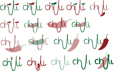
Here is the first process of my logo design to put onto my labels, I experimented with different brush strokes, layouts and colours to see which one looked the best to carry on with for further design.
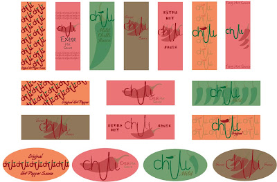
I then went on to creating the label by adding background colour and type to create stylistic piece to become eye grabbing if it was in a context on a supermarket shelf.
But from my first Crit I needed to improve on creating more personality and impact so that they would stand out from other designs in the supermarket so that they would be seen.


No comments:
Post a Comment