Thursday 22 January 2009

Top 10 Hair Styles Digital Media Brief Currently working on at the moment

Here are a few things that I designed for my Top Ten Hair Styles, ranging from creating my own font, to using my own hair in an illustration.


Sunday 18 January 2009

1937 Calender Design


For this brief we were given a date I was given 1937 we were to research this date till we found the top 10 most interesting facts about it, there wasent really very interesting events that had gone on in that year but I did find that the Snow White disney film was first shown in colour this is what I decided to base my calender on. Showing a full colour calender with full colour illustrations.

Confused

Using a serif or sans serif font we were to create the word using weight, leading, and kerning to show an action, the first one I did was to say the word confused normally like you were having a conversation with somebody. I used the font Gill Sans.


I then went on to show confused quietly changing the weight and size of the font.


After I showed confused loudly by using the Gill Sans Bold and changed the leading of the letters closer and made the size of the font larger and aligned the text central.


I then showed confused as if you were saying it slowly I set the leading high so the letters were far apart from each other I also chose Gill Sans light as it makes not so easy to read.


Next we then to create the word confused on how we say it I was saying so the fused of confused was loud and long and the con of confused was quick. I used different weights to show this and leading to have it spaced out evenly.

Stretch

Using a the word stretch now we had to goo through the same process but using a different font I chose the font Helvetica Nue. I showed stretch loudly by centering the text and making it bold.


I then showed stretch very slowly by changing the weight of the font and I also split the word into two making it extra slow to read.


I then had to make stretch even slower to read so I stacked the letters on top of each other to make it harder as well as slower to read.

Boom, Stretch, and Confused

With the three words using the same font and alignment throughout we had to make the words a hierachy so the words would be read differently.
Here I made confused to be read first then stretch then lastly boom. To make confused read first I put a black background behind it and made the text white, I then made stretch bold and boom light.


I then made confused black and bold, stretch grey and bold and boom grey and the weight light/italic so the different words could be read with all of a different hierarchy.


I then made confused all in CAPITALS and bold, then stretch I made the leading higher so the letters were furthur apart and boom was grey with the weight light.

L

Using my first initial we were told to form a pattern I chose to use a serif font, I locked the two letters together one being rotated upside down which formed what looks like a roman numeral.


Here I chose a sans serif font to create pattern but rotating the letters to form a repetitive pattern.


With this we were told to use a our intial again but in lower case, I didnt think about this pattern I just did it and that seems to be the best way because it turned out to be quite successful I didnt intend to make an image out of it just somehow happened and it looks quite like a castle or something out of mario lol!

Typographic Animation

As part of the Digital Media brief, I was to create a silent animation from a selection of words in Adobe after effects. I chose to work with the words Boom, Stretch and Confused. I worked with a limited colour palette red and black and using to fonts one being light and the other bold. I had to think how effectively I could communicate the letter forms using movement creatively. Before choosing my final animation I was testing out a few other ideas, frames and formats.

Saturday 17 January 2009

Final Posters

Here are my final posters to promote each of the chilli sauce using the colours, and type that I have use for the labels and recipe cards to create a set.


Final Recipe Cards

Here are the final recipe cards which will be printed out back to back on matt paper.


Photographs of Labels Back and Front

Here are my labels photographed adding the chillies I think is a good effect as it puts it into a situation. The photographs look good also with the labels put onto the bottle makes it look more realistic on how it would look.


Final Labels

These are the final front and backs of the labels, Ive used the font James Fajardo for the front and back Ive used this font because it is a typeface that looks as though it is created for a sauce from the way it flows and is a little splattered in places, I will be using this font for my posters and recipe cards to create a set I will also be using the colours that I created for my label for the use of the poster and recipe cards.

More development of Chilli Labels

My next focus was to look at the chilli stalk by maybe considering manipulating it by changing the stalk to a exclamation mark to show that it is hot as it looks and to create it as a statement. I also played around with the colours to see if this was effective.

I do like the exclamation mark as the stalk because it is different but I don't think it looks realistic as it did before. Taking the background colour away makes the label stand out allot more as it doesn't feel as its been merged in with a colour background making it look hidden, getting opinions from my piers made me realise that the white labels looked much better and stood out from the paper.

Chilli Labels Development

I tried to base my designs on impact so focusing mainly on colour and layout for these I created some typographic eye catching labels.
Compared to my other labels that I designed before these have improved alot on colour, and impact and look what they are trying to say HOT!
I generally prefer the long portrait labels because they look more appealing and quite simple but still visually appealing. I would now need to experiment with different background colours and different typography headings to move on to the next stage of putting it into context and photographing it.


Design Ideas for Chilli Sauce Labels and Logo

For this brief I wanted to promote, persuade and inform that chilli sauce is good to an audience of younger and older adults and other people that are already interested and like chilli, I have created 4 labels for Extra Hot, Hot, Original, and Mild Sauce. This will then lead on to create recipe cards for each type of sauce so the users can put the sauce to good use.

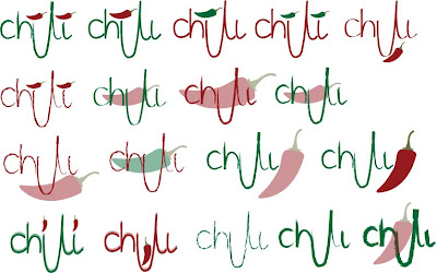
Here is the first process of my logo design to put onto my labels, I experimented with different brush strokes, layouts and colours to see which one looked the best to carry on with for further design.

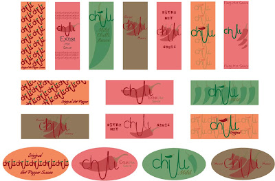
I then went on to creating the label by adding background colour and type to create stylistic piece to become eye grabbing if it was in a context on a supermarket shelf.

But from my first Crit I needed to improve on creating more personality and impact so that they would stand out from other designs in the supermarket so that they would be seen.


Dont Panic

Out with the Old in with the New....

This was for a competition for DontPanic the statement for the poster was Machine, you could respond to it anyway you liked in any shape or form, I chose the telephone comparing the difference between old and new machinery using and old classic phone and the modern Iphone.
I used the technique of merging the two images to show a clear comparison of the two.

Colour Processes


Over the summer we had to collect a range of research to record our summer, from this research we had to choose one image or piece from our research that summed up as a whole about our summer. I chose an image from the Punting line in Cambridge.

With this image we were to experiment the six colour processes to show that we understood them as a layout page. Showing other examples of each process and a description here are my final layouts shown above.

Reaction Photography

These were the final photos for my Elective showing a reaction to the bursting of a balloon, To capture the reaction at the right moment I used a high shutter speed, To create the right lighting that I wanted I bleached the background with very bright lighting to create a bright white background which then you can focus on the portraiture.